This article explains how to optimize your campaign for mobile using the mobile stacking tool.
Mobile Stacking Overview
When sending newsletters and communications via email, content is predominantly organized in multiple columns. In order to guarantee an optimized mobile experience, our drag and drop* editor automatically stacks columns vertically for users who are viewing mailings on mobile devices.
Without creating any extra steps, the email content is reorganized in a way that makes zooming unnecessary and is easy to scroll with a finger. However, you can choose to turn this automatic feature off when creating a campaign in the drag and drop editor. We’ll go over how to do that and a few other options that can impact the mobile version of your design below.
Mobile Layout Behavior
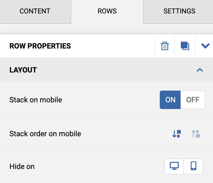
In the drag and drop* editor, mobile layout behavior is controlled at the row level, rather than the campaign level. To modify a row’s mobile layout behavior, follow these steps:
- Click on the row whose mobile layout behaviors you want to change to open the Row Properties panel on the right.
- Scroll down to the “Layout” section.
- Mobile stacking: Use the on and off buttons to enable or disable mobile stacking for that row.
- Mobile stacking order: When mobile stacking is on, use the directional buttons to choose the order that you’d like stacked contact to appear in.
- Hide on: Use the desktop icon to hide the row on desktop. Use the mobile icon to hide the row on mobile.
- Repeat as desired.
The mobile stacking option is toggled on by default for each row in your campaign. You’ll need to be careful about changing this option, as it’s important to be sure you do the same for all of the rows in your campaign, or the campaign content may not format correctly on mobile. You can also choose to hide specific content blocks on mobile or desktop from the Content Properties panel.
Mobile Stacking Tips
Most Email Clients Support Mobile Stacking
Overall, vertical stacking is supported by the most common mobile email clients. However, in some cases, the desktop version will be displayed instead.

One Size Does Not Fit All
Although it normally helps, there are cases in which vertical stacking of columns may not lead to an optimal result. A common scenario is using a row to display a navigation bar with text links or icons.
In that scenario, a vertical layout could create excessive empty space and either hide important elements of the message or give too much visibility at the top of the email to content that is not supposed to be that prominent. An easy fix for this would be to use the menu block to add a perfectly spaced navigation menu.

Additional Resources
* In April 2022, our legacy editor was replaced with a new drag and drop editor. Accounts that existed prior to this change still have access to the legacy editor through their previously saved templates and campaigns, however new, from-scratch campaigns can only be created in the new drag and drop editor. Accounts that were created after this change only have access to the new drag and drop editor. Please refer to our new editor FAQ article for more information.

